Some things never change. They stand forever as bastions of the status quo. Unchanging, undying, and forever representing beacons of reliability. Everything will be alright as long as these epic pillars of stability remain as they have always been, reminding us that the world we live in is built on solid foundations.
![]()
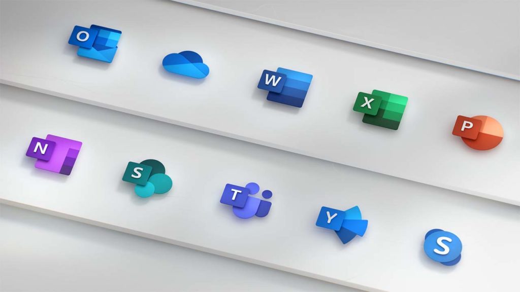
In the tech world, Microsoft has been one such pillar and, at its heart, Microsoft Office has for so long provided us with the type of mundane security you can only take from something that is slow and steady while also being completely and totally reliable. Microsoft Office doesn’t bother being sexy, it just gets the job done. You might have noticed, however, that things are changing over at Microsoft Office headquarters. Things are starting to look different and the Microsoft Office icons, have started to look, well, cool.
The new Microsoft Office icons are part of new design philosophy
Microsoft does change the Office icons, but the changes are often slow and slight. The last time Microsoft changed the Office icons was over five years ago and the icons pretty much stayed the same, they just looked a little more modern. This time, however, there has been quite a leap from the old to the new and there is good reason for the significant change.
As well as modernizing the look, the new icons are supposed to be much simpler too. This is because Microsoft Office apps now reach out across multiple platforms and Microsoft wants them to be adaptive across each of them. You can use Microsoft Office apps on Windows, Mac, Android, and iOS devices; Microsoft wants the icons to reflect this big change for its core productivity suite. On top of this, the new icons are supposed to represent other key changes to the Office apps including the new AI features and collaborative aspects that have been baked into Microsoft Office.
The icons redesign marks a small part of a complete design overhaul as Microsoft brings the Fluent Design from Windows 10 to the Microsoft Office apps. This change will only bring about small and subtle changes but will modernize the look of apps like Word and Excel while giving Microsoft apps a more consistent look. We’ve also seen Google recently moving to align design aspects across all of its major apps, too.

Check out Google Keep’s new design
Read nowThe big changes in the new Microsoft Office icons show the letter for each app playing a much less significant role. The W in the Microsoft Word app is now much smaller, with the app’s blue color now playing more of a role in making the icon recognizable. Jon Friedman, who is a partner director of design at Microsoft, explained the change in a blog post published on Medium, “Our design solution was to de-couple the letter and the symbol from the icons, essentially creating two panels (one for the letter and one for the symbol) that we can pair or separate… This allows us to maintain familiarity while still emphasizing simplicity when inside the app.”

The good thing about all this is that we don’t need to worry. Society is not about to start crumbling around us as we’ve lost the solid foundation of something we could always rely on. Despite the significant change to the Microsoft Office icons, they are still instantly recognizable. If you’re a Microsoft Office 365 subscriber, you may give a quick double take next time your apps update, but you’ll definitely know which app is which.


